Healthy
Helping seniors manage their health with this adaptive, AI-based health and wellness app.
- Role
- Staff Product Designer
- Team
- Lead and managed a small team of 3 designers
- Focus
- UX/UI, Product Design, Prototyping, Branding, Front End, Figma, Mobile, Web
- Year
- 2025
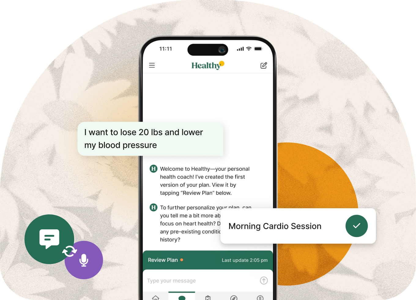
Overview
The first thing I did at Healthy was lead a full brand refresh. The product had been growing in a visual direction that felt cold and disjointed, so before touching individual screens, I set out to define a clear visual identity and then apply it consistently across the entire experience with a full design system revamp.
Process
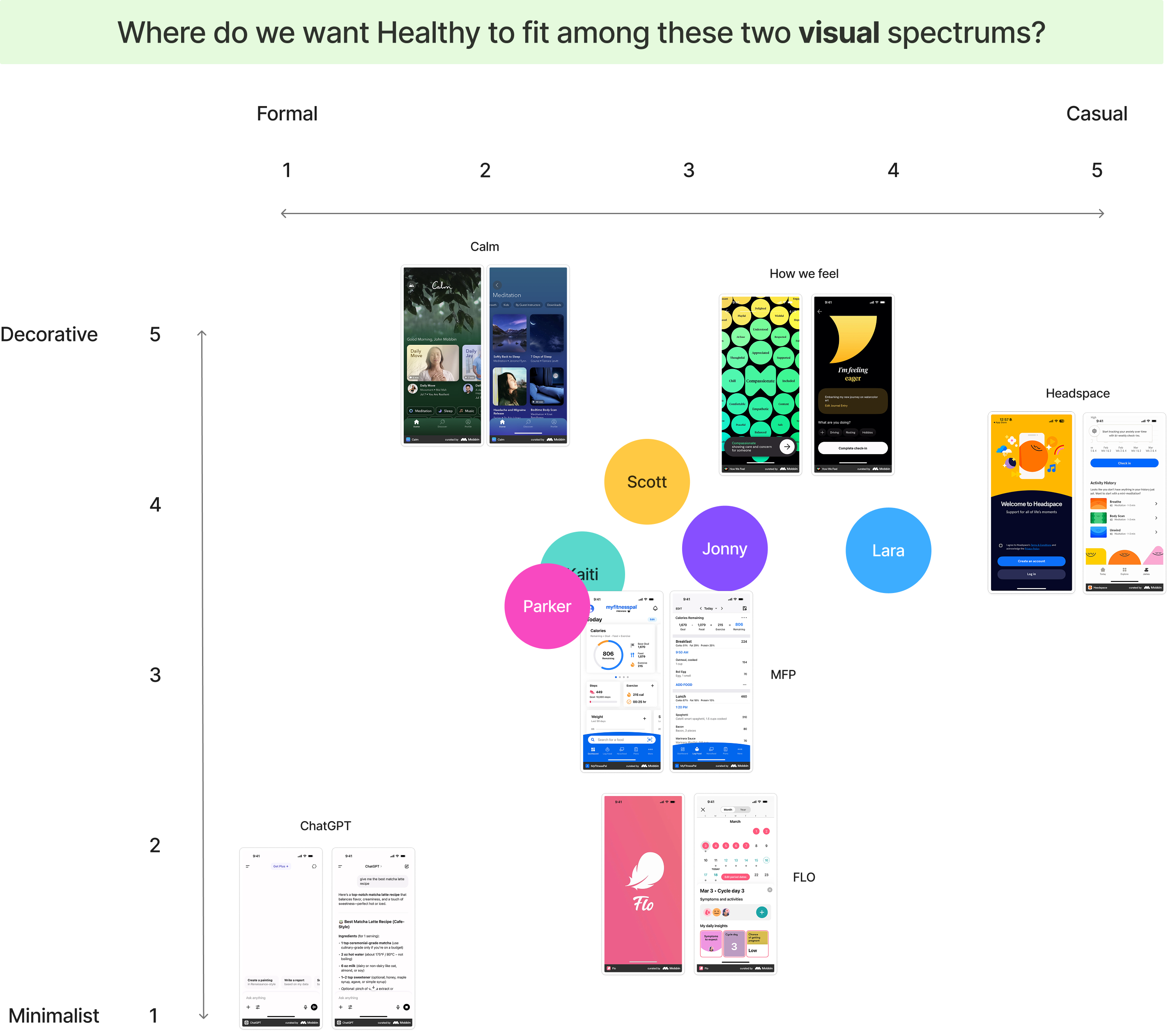
I approached the refresh as a structured, multi-step process so that every decision built on the last. It started with a visual identity plot that mapped where the brand sat today and where we wanted it to go relative to the competitive landscape.
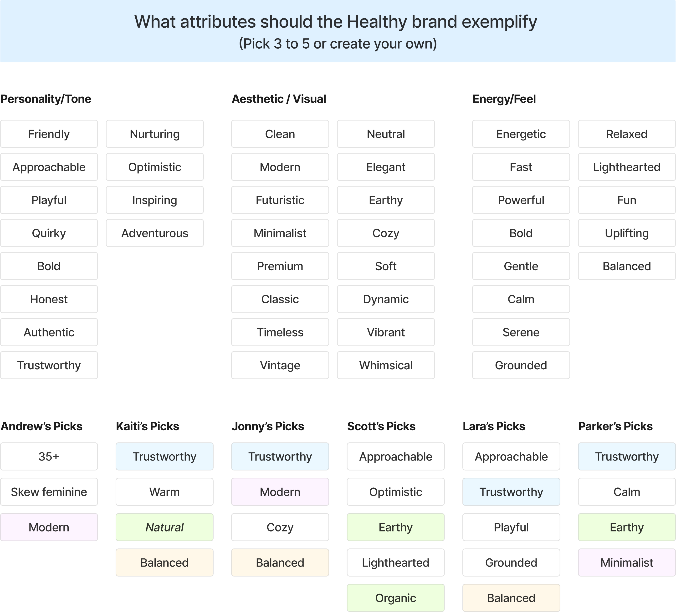
Next came an attribute mapping exercise. Each stakeholder completed it independently so no one would be swayed by anyone else’s opinion. That let us see honestly which brand attributes resonated most with the group. There ended up being a considerable amount of overlap, which allowed us to quickly jump into the next phase of the rebrand.
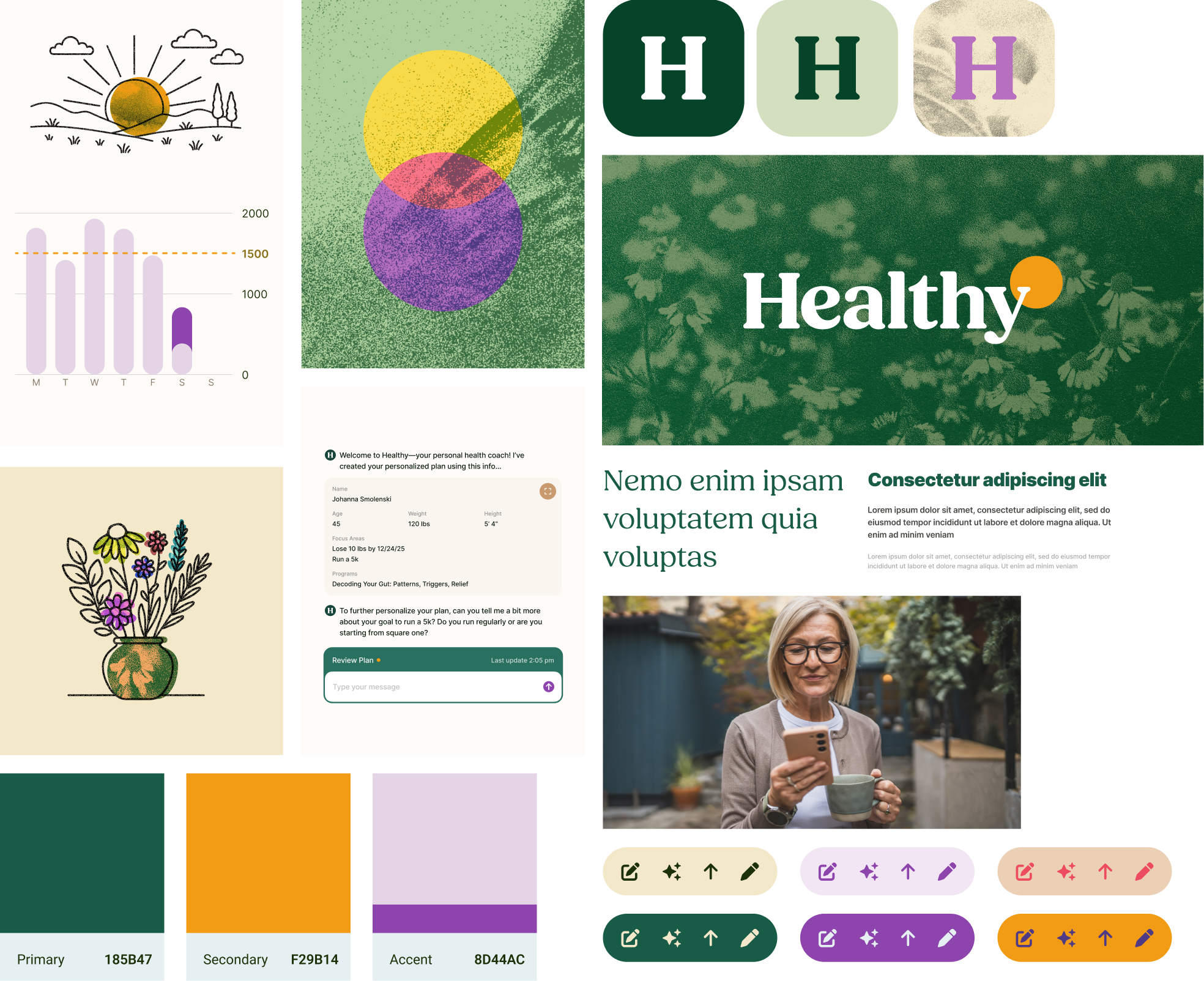
With our attributes agreed on, a moodboard of the existing brand was built as a reference point, along with alternatives that each leaned into the attributes we’d just prioritized. This gave stakeholders concrete, comparable directions to weigh.

After a few rounds of revision, I got executive sign-off on our final moodboard, the foundation everything else would be built on.
Brand Application
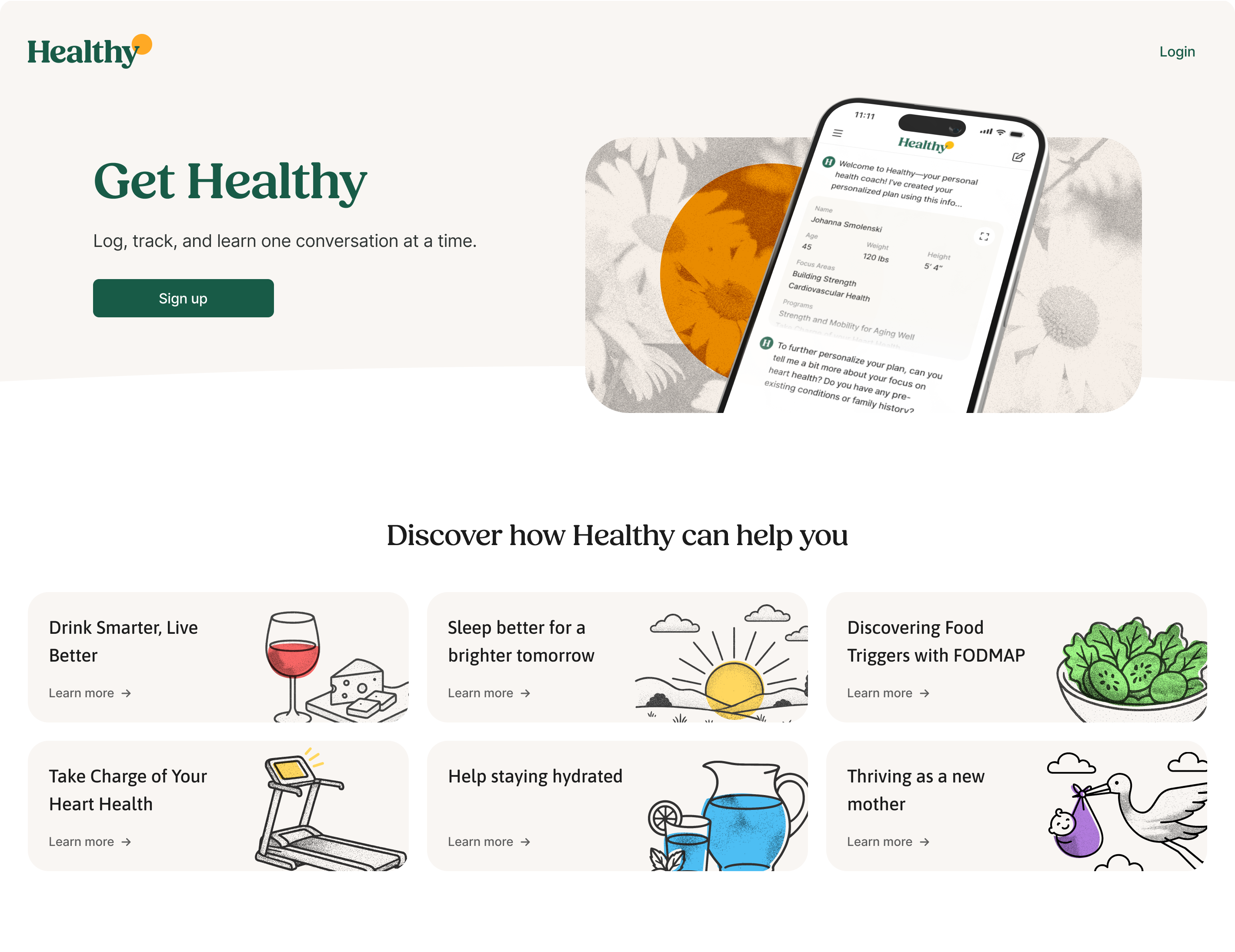
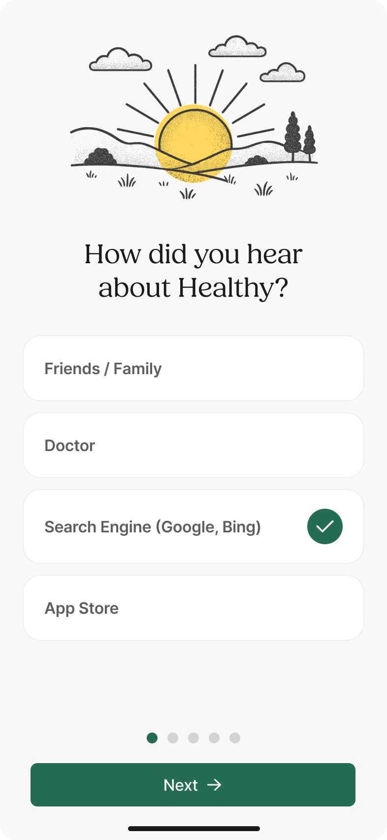
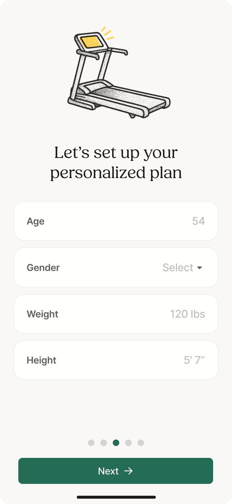
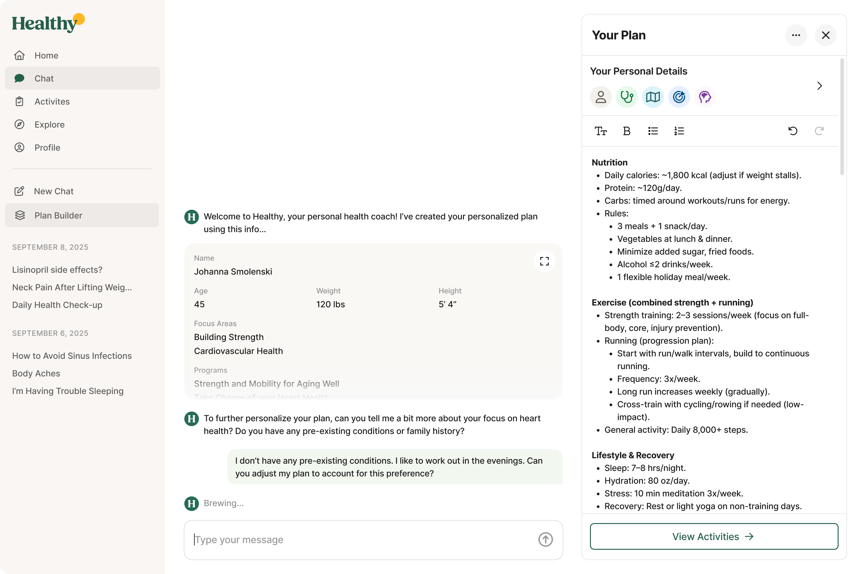
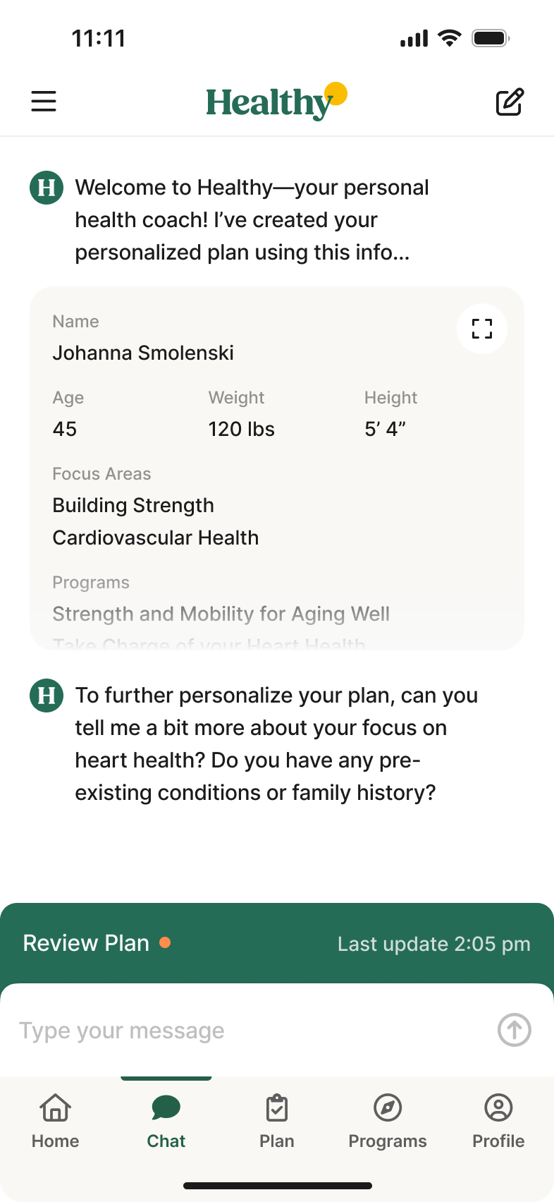
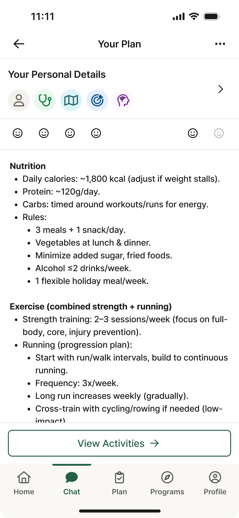
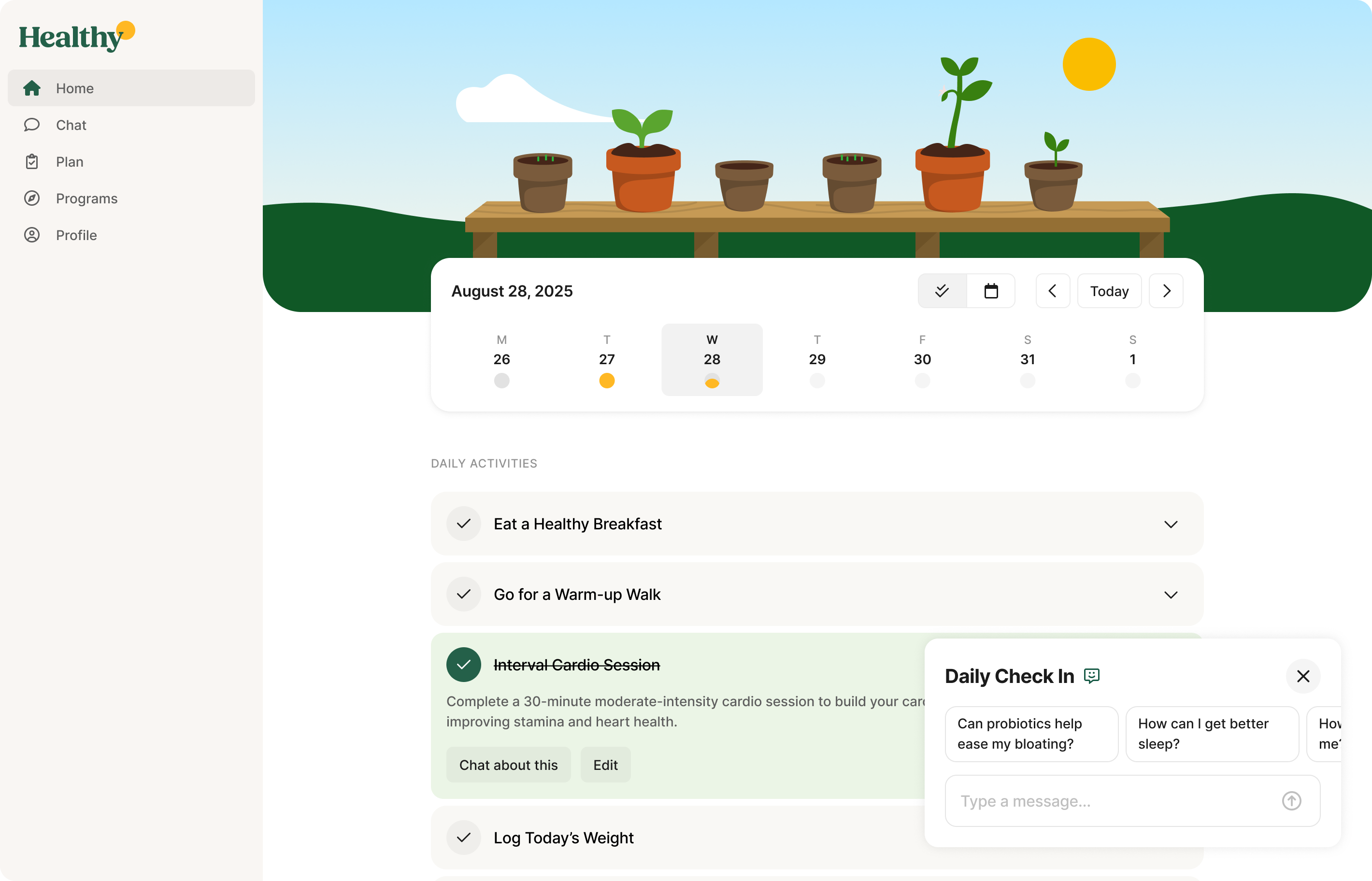
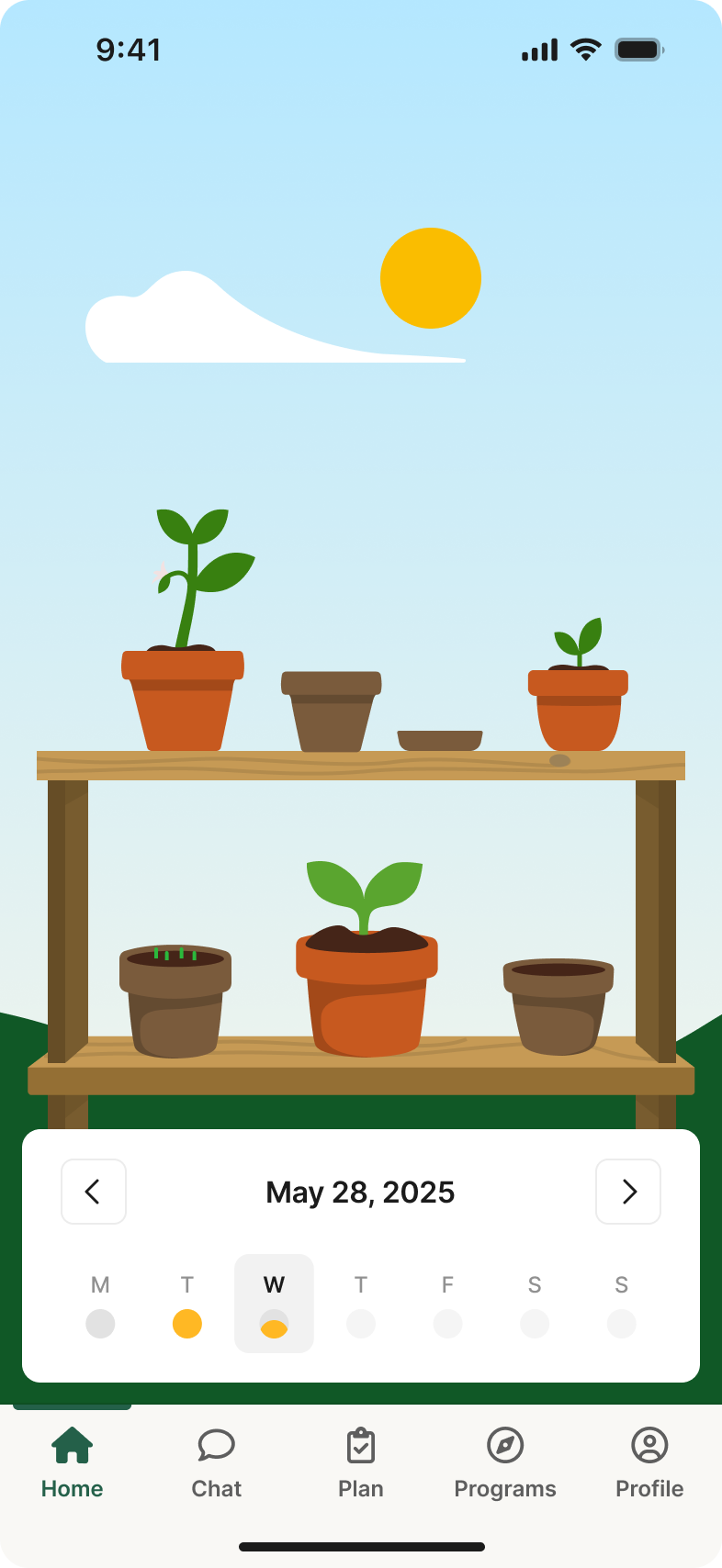
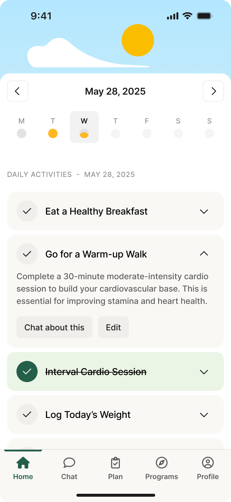
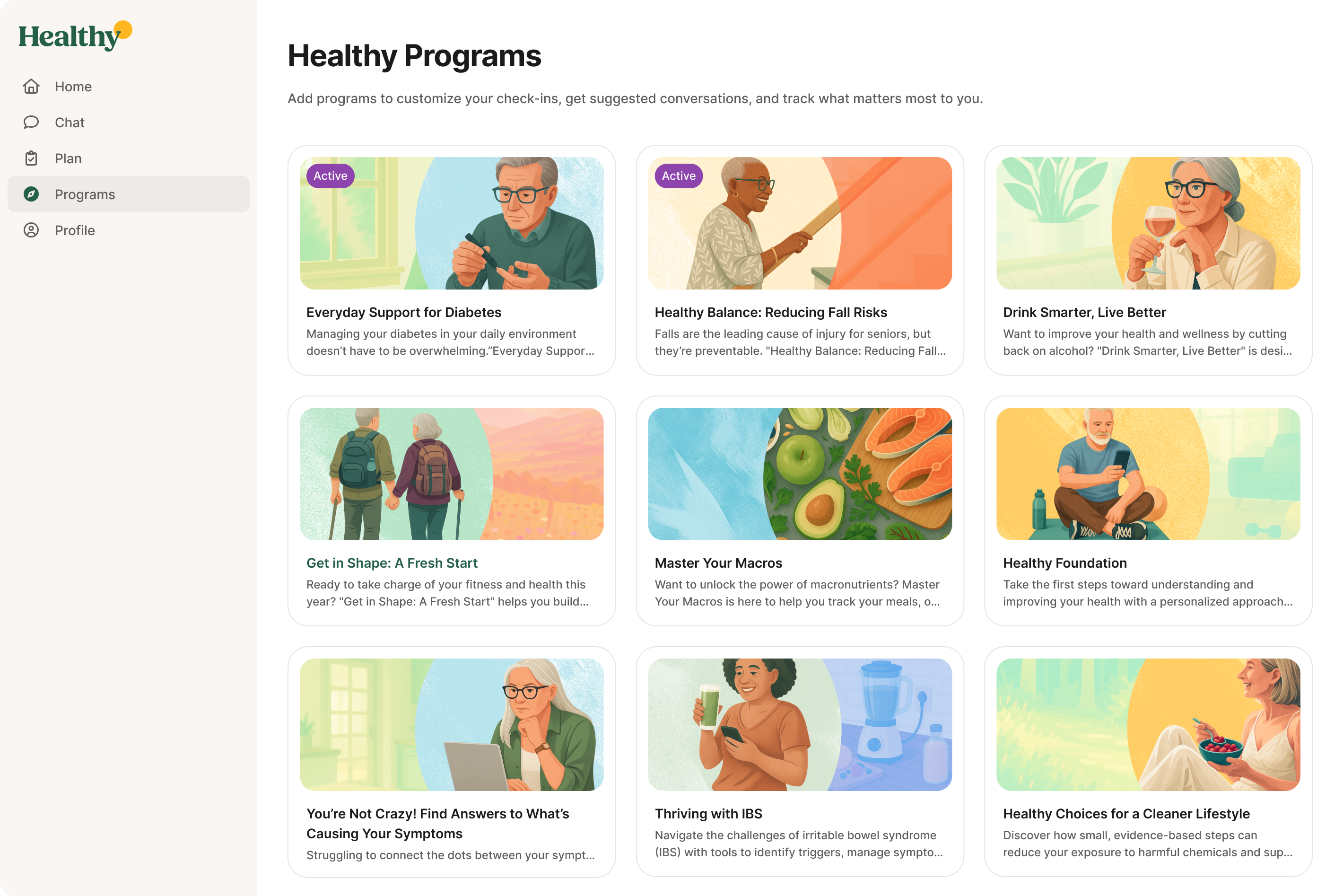
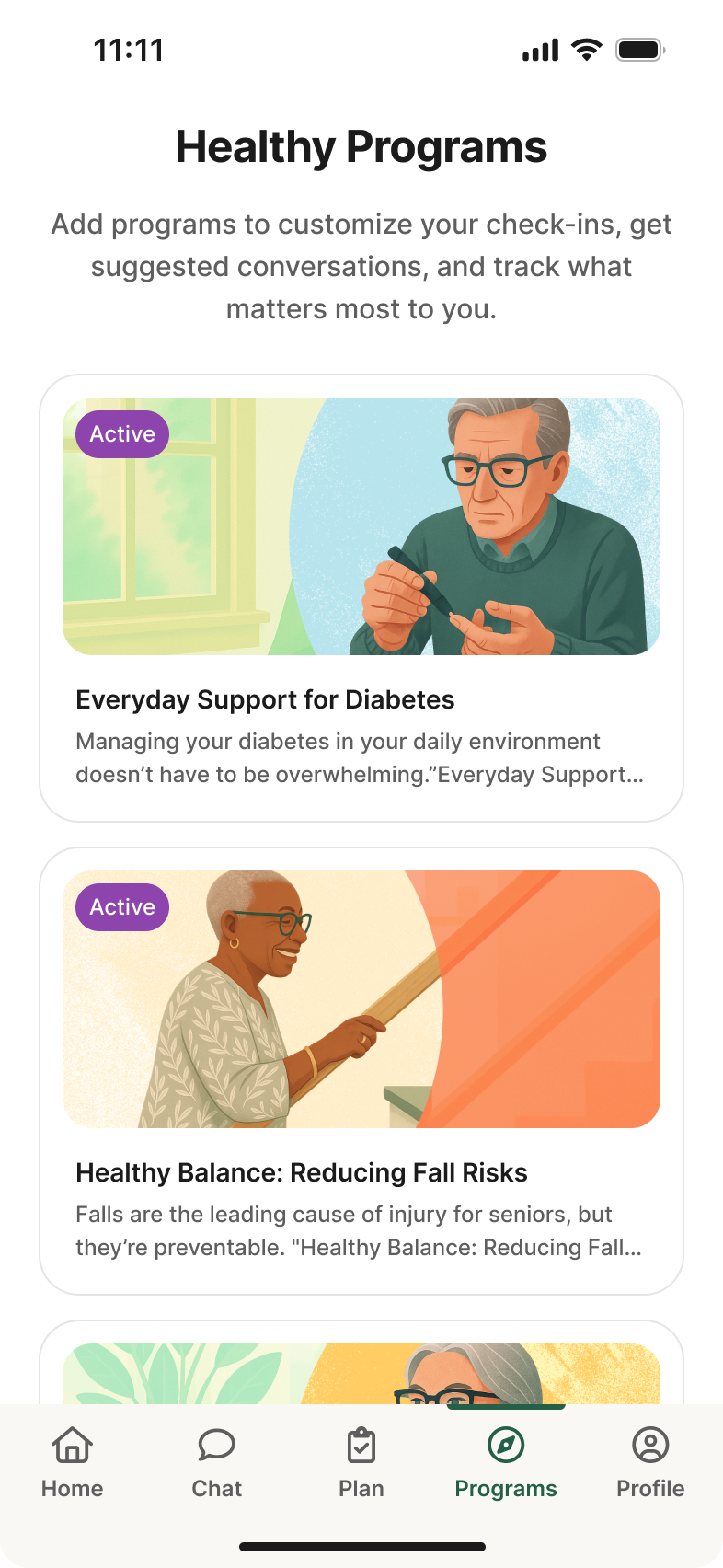
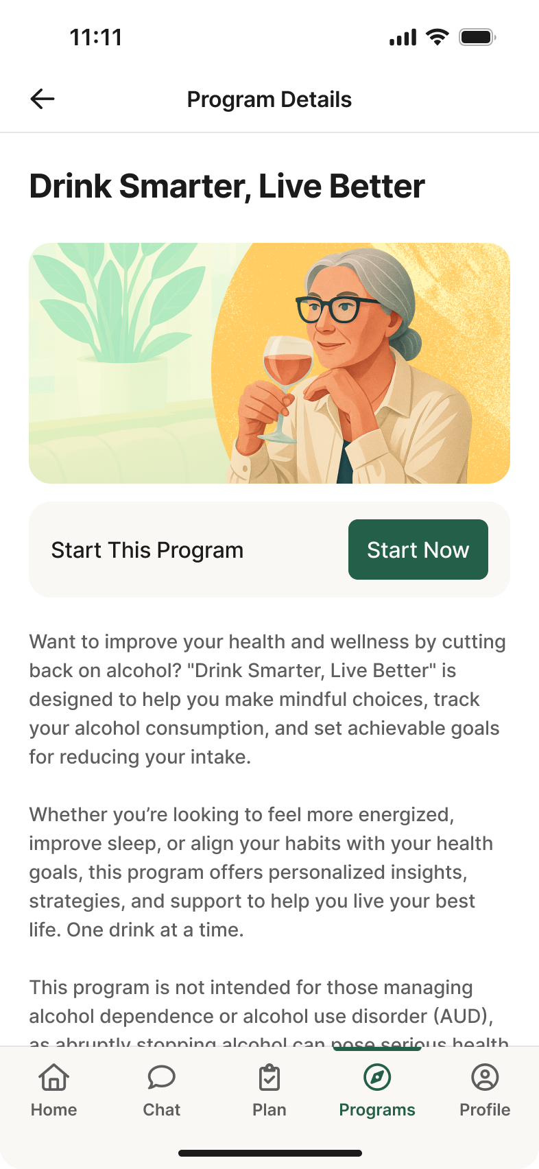
Below are a sample of pages I redesigned to fit the new brand. Our tech stack was built on React Native, so I designed for both web and mobile to keep the experience consistent across platforms.